The Tale of Two Logos
Exhibit A is the new design for one of the UK’s most recognisable, trusted brands. The other represents a brand-new organisation, not yet 6 weeks old that’s creating waves on an established political scene.

Exhibit A - BT’s new logo

Exhibit B the Brexit Party’s logo
These two completely different businesses have created much discussion over recent weeks, not least because of their new logos. From controversial positioning to lack of originality, they highlight a stark comparison in terms of effective and symbolic logo design.
BT’s new logo reflects a design trend that many other large brands have adopted over the last 12 months. A black and white, sans serif font that on first glance, lacks any suggestion of values, heritage or identity. Apparently, it comes to life in its ‘execution’.
Conversely, The Brexit Party’s logo has utilised the design to help suggest a specific message and action. The arrow on ballot papers conveniently pointed directly at the box where X marks the spot. The suggestion their party is the only way to progress, simply highlighted by the forward-facing arrow.
Design in its very essence is subjective. Creating art that will appeal and be favoured by everyone is unachievable and, in all fairness, undesired. However, you also do not want to create something that has a universal feeling of ‘meh’.
The BT logo unfortunately for me, falls into the latter. It is not offensive nor original. The fact that so many others before it have used a very similar composition and colourway suggests that lots of other brands have felt it is the way to go and the trend to follow. However, when you compare it to BT’s previous logos, it does seem like the business has lost any real personality or identity. Are designers become scared of design?
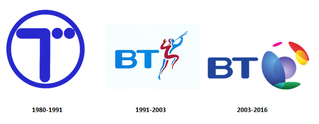
image from https://www.pixelslogodesign.com/blog/bt-ready-for-a-new-logo-by-futurebrand/
Whether you agree with their politics or not, the Brexit Party’s logo stands out against its competitors. Described as a ‘very clever piece of graphic design’ by Designer of the Year, Ben Terret, it was apparently devised by the inhouse team after sharing a few ideas together. Compare this to the agency designed logo for BT which undoubtedly will have cost considerable time and money to create something that unfortunately looks like it was thrown in to bulk out the potential considerations last minute.
As discussed in our previous blog, Your brand is so much more than your logo What your business stands for, it’s values and relevance to your customer is communicated through numerous channels including customer service, social media engagement, website, PR, staff. The logo is the cherry on top. However, it still has a part to play and your customers will make assumptions and judgements based on it.
Will BT lose customers because of their piss poor logo? Hardly. Although I don’t like it, it’s not making me want to cancel my subscription in disgust. However, will it attract new ones? Will it stand out in an increasingly competitive marketplace and resonate with the audience going forward? We’ll have to see how effective that ‘execution’ is.
Similarly, the Brexit Party’s logo is not going to be the deciding factor on why people will support or vote for them, despite the ‘subconscious’ argument of the arrows positioning on the ballot paper. What it does do is signal an engaging and clear position for their target market which is primarily the purpose of the logo.
Main Photo supplied by rawpixel.com on Pexels